
Business is about selling. And to sell something online, you need a call to action (CTA) persuasive enough that it gets people excited.
Writing a call to action that reinforces a potential customer’s desire to buy and creates a sense of urgency is a craft—and power words are the secret ingredient of this craft.
By the end of this article, you’ll discover 50 power words you can use to create compelling calls to action. We will also go over 50 effective CTA button examples to give you some ideas and inspiration. Read on!
What are power words?
Power words are words of persuasion. They are the key elements of your sales pages or marketing campaign messaging — power words get people to interact with your brand online, increasing your conversion rates.
When used correctly, power words are emotional and psychological triggers that are difficult to resist. For example, copywriters often say that the most powerful word in advertising is “free.”
Indeed, if you’re interested in something, “free” is hard to turn down. But what are some other examples of power words that you might want to use as part of your CTAs?
50 power word examples
Power words are not random. To trigger a desired effect — whether it’s liking a post on social media or clicking on an ad — they have to tap into your audience’s primary emotions and/or suggest immediate benefits.
On a high level, you can group power words into five categories based on the emotions they cater to:
- Greed
- Curiosity
- Laziness
- Trust
- Encouragement
Power words can, of course, be divided into even more categories — but if you learn how to appeal to these basic emotions in your CTA buttons first, you can often build up your conversion rates from there.
Below, you’ll find specific examples of power words from each category.
Greed
- More
- Cheap
- Fast
- Best
- Save
- Exclusive
- Gift
- Prize
- Big
- Giveaway
Curiosity
- Unique
- Crazy
- Priceless
- Spoiler
- Shocking
- Behind-the-scenes
- Insider
- Bizarre
- Little-known
- Stunning
Laziness
- How-to
- Easy
- Now
- List
- Complete
- Comprehensive
- Clear
- Accessible
- Effortless
- Guide
Trust
- Expert
- Secure
- Authentic
- Guaranteed
- Lifetime
- Approved
- Professional
- Proven
- Refund
- Tested
Encouragement
- Amazing
- Legendary
- Awesome
- Perfect
- Mind-blowing
- Brilliant
- Remarkable
- Empower
- Surprising
- Breathtaking
Wondering how you can use these power words to your advantage? Mix them up to create powerful call to action phrases.
What’s a call to action (CTA)?
A call to action (CTA) is the part of a blog post, landing page, email subject line, or printed ad that encourages website visitors or potential customers to actually do something.
The action could be clicking the button to download an ebook, signing up for an email list, trying a free demo, etc. The goal of a CTA is to convert your audience into leads or customers.
What makes a powerful CTA?
Have you ever signed up for a newsletter or clicked on a product online just because it seemed interesting? Congrats — that means you’ve already seen the power of a good CTA in action.
While CTAs rarely change people’s minds about fundamental values and beliefs, they remove barriers from taking an action to make it seem effortless.
Here are a few signs of a good call to action:
- Uses power words (such as the ones listed above)
- Evokes emotions
- Is short and clear
- Is easy to remember
- Speaks directly to the audience
50 powerful call to action phrases (real examples)
Let’s look at some real CTAs used by companies worldwide. Take note of some of the different strategies you can use to encourage action with your audience.
1. Weebly: Create your website
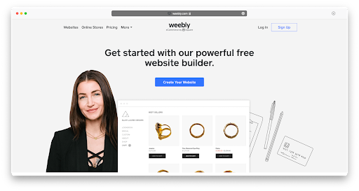
Proactive, specific, short and clear CTAs always work — that’s what makes this example from Weebly effective. You can guess that Weebly is a website building tool right away, even if you’ve never heard of them before, because the CTA does a good job highlighting their value proposition.
2. Descript: Create your free voice model
This more complex call to action by transcription tool Descript is interesting because it builds a sense of intrigue. It’s likely that you don’t know what a voice model is, but you’d probably like to find out.
3. Kickstarter: Start a project
In another short, specific, and catchy example, crowdfunding platform Kickstarter manages to augment their brand name with a CTA that explains the value prop while highlighting the simplicity and excitement of starting.
4. Webflow: Start building
Just like Weebly, Webflow (another website builder) is putting action first — but this brand decided to go for extra brevity. The CTA relies on brand recognition to shine a light on the type of “building” you can do.
5. WeTransfer: Transfer
A very utilitarian approach by WeTransfer is to eschew marketing copy altogether and set their CTA in a functional web app form users can fill out to actually transfer files.
6. mymind: Take back your mind
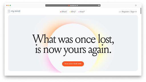
Another great CTA from the notetaking wellness app mymind speaks directly to the audience and evokes emotion based on the brand’s manifesto of gathering all ideas in one private place.
7. Betabrand: Join the conversation
As a project-based clothing brand where customers can vote for new products, Betabrand decided to elevate their value proposition with a CTA focused on community.
8. Practice: Request early access
Even if your brand is not yet launched, a CTA to build your email list can make it much easier to grow your audience ahead of time.
9. Prezi: See how it works
Prezi’s CTA evokes curiosity, and acknowledges that it’s much more effective to show how their unique solution than to write about it.
10. Clearbit: Explore the platform
Since highlighting all the features of your product in your website or ad copy is often impossible (due to word count limitations and short attention spans), inviting users to scan through your platform’s features could be a great middle step before they’re ready for a demo.
11. Noah Kagan: Spice me up
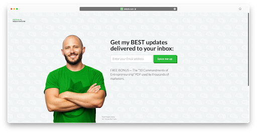
CTAs can be humorous. Fun calls to action are easier to remember and can leave a positive first impression about your brand.
12. Cloudflare: Under attack?
One of the best CTAs in this list is Cloudflare’s direct anticipation of its users’ needs. The CTA for their cyber protection tool is not just short and clear — it’s also powerful and specific.
13. Xero: Learn what Xero can do
Some brands, such as Xero, don’t want to seem pushy with their sales. Instead, they use CTAs that are inviting, friendly, and useful at the same time.
14. Ugmonk: Shop Analog
Another utilitarian solution by design studio and online boutique Ugmonk is to simply refer to the name of their best-selling collection of goods. If you end up on Ugmonk’s website, it’s likely that this is exactly what you’re looking for.
15. The Browser: Become a subscriber
Blogs and media publications that don’t have products to sell should still think about how they can deliver information to their audiences and build engagement over time. Inviting people to subscribe to a mailing list is a good, non-pushy way to do that.
16. Harvest: Try Harvest free
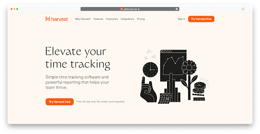
As mentioned above, “free” is one of the most effective power words. So much so that adding “free” to almost any CTA will improve its conversion rates. Time-tracking software Harvest seems to know what works.
17. HubSpot: Start free or get a demo
Giving visitors a choice between two options is a good idea. Merging two options into a single CTA is even better, since it removes decision-making without removing agency.
18. Fastmail: Try it free for 30 days
Unlike Harvest or HubSpot, Fastmail specifies that their product isn’t free forever — you only get a free deal for 30 days. This sets realistic expectations and outlines the details of their value proposition — a free trial — in just a few words.
19. YNAB: Start your free trial
Another way to make sure your users know that your product isn’t free forever is to mention that they are signing up for a trial upfront, like YNAB does.
20. Buffer: Get started now
The power word “now” adds urgency to any CTA and suggests that a solution is ready to be used, with no complex setup required.
21. Tim Ferris: Unlock the ebook

Appealing to one of the basic emotion of greed, entrepreneur and motivational speaker Tim Ferriss lets his visitors know that they will get something of value — not available anywhere else — in exchange for their email address.
22. Accenture: Read our new report
Companies that sell services often decide to hook leads in and prove their capabilities by making proprietary research, case studies, or testimonials available for free — which is exactly what Accenture is doing on their website.
23. Medium: Start reading
In their CTA, Medium tries to remove barriers to enjoying the core experience of their site, which is reading.
24. Affirm: Learn more about us
In a multi-CTA strategy, you can make sure that some CTAs are as direct (and “salesy”) as possible, and others simply provide more information about your product or service.
25. Airbnb: Start your search
The most important role of a CTA is to get a user to engage with your product. Airbnb includes a simple CTA right in the search field on their platform and only moves on to login and signup focused CTAs when it’s necessary.
26. Stripe: Start now
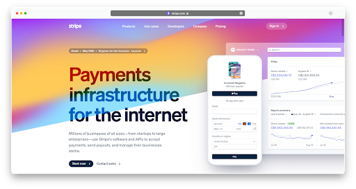
Explaining what your product does with a great headline and reducing your CTA to two power words like “start” and “now” is an effective combo, as showcased by online payment platform Stripe.
27. Wise: Compare price
Just like WeTransfer and Airbnb, currency conversion tool Wise puts its CTA right into the conversion form on their website, so users can engage with the product right away.
28. freeCodeCamp: Get started (it’s free)
We’ve seen examples of how you can tell users that your product is free only during a trial period. freeCodeCamp tries to do the opposite, focusing on the fact that it’s free forever.
29. Beyond Meat: Find near me
If your product is sold through retailers, helping users find the nearest one is probably the most actionable thing you can do.
30. Boom: Learn more
When your solution is as complex as a supersonic jet that’s not yet for sale, there’s no rush to get website visitors to convert. Using a simple and informational CTA works well enough.
31. Ghost: Test it out now
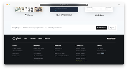
Making it easy for your users to try your unique solution will definitely positively affect your conversion rates.
32. Oura: Shop now
“Now” is a strong power word that can reinforce different verbs with the notion of urgency. “Shop now” is about as actionable as it gets for ecommerce-related CTAs
33. Sweetgreen: Order now
When you know that visitors are coming to your website to place orders, making that option immediately available is the most effective thing you can do.
34. AngelList: Invest now
Even though the CTA “Invest now” might seem like it’s about immediacy, it really speaks directly to visitors’ aspirations. Anyone visiting the website is likely looking for ways to invest their money, and AngelList offers a way to do exactly that in a quick and straightforward way.
35. DoorDash: Enter delivery address
DoorDash asks users for a delivery address in their CTA because they know that users come to their website to have food delivered there — and entering an address brings them one big step closer to placing an order.
36. AppSumo: Gimme the goods
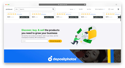
In a similar message to the one from Tim Ferriss, AppSumo highlights the value website visitors are going to receive in exchange for providing their email address.
37. Lyft: Apply to drive
In their short and clear CTA, Lyft lets potential drivers know that there’s an application process they have to go through before they can start driving on the platform.
38. GitHub: Sign up for GitHub
GitHub uses a standard “Sign up” CTA but wants to reinforce its brand name by putting “GitHub” right after the actionable power words.
39. Slack: Talk to sales
If you’re targeting enterprise clients, it pays to show them that you understand the process they are used to, such as meeting and negotiating with a sales team before signing a large contract.
40. Lever: Let’s talk
A more friendly approach to enterprise sales can be seen at Lever with their casual “let’s talk.”
41. Firefox: Download Firefox
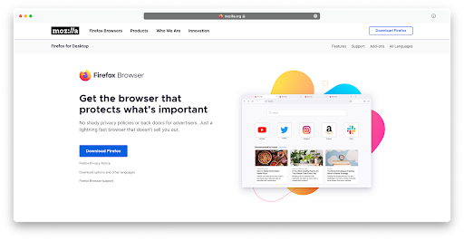
If your app has as much recognition as Firefox, you don’t need to say more than “Download [brand name]” in your CTA. This is primarily why users visit the website.
42. Plaid: Get API keys
Unlike other companies, Plaid uses an exclusion strategy in their CTA by making sure only developers, who know what APIs can be used for, proceed to work with their platform.
43. Backblaze: Meet personal backup
With a completely opposite approach to Plaid, Backblaze is trying to make technical solutions like B2 storage and backups seem more accessible by using simple, casual language.
44. Uber: Request now
As a service that lets users request rides all over the world through their mobile app, Uber’s website highlights that the same can be done on a desktop device.
45. Mixpanel: Take a tour
If you have an app that requires some training, letting users sign up right away is not such a great idea, since they’ll likely leave shortly after. But show them all the features with a quick tour and they’ll be more likely to stick.
46. Ramit Sethi: Start the quiz

Another way to increase engagement is to invite website visitors to take a quick quiz that will provide them with personalized recommendations for which solutions best fit their needs. That’s what Ramit Sethi is doing here.
47. Lime: Our vehicles
Unlike Uber, Lime has chosen to keep a more informational approach on its website, describing its multimodal fleet instead of letting users book bikes and vehicles on the spot.
48. Hipcamp: Start hosting
Not only does Hipcamp use a short and clear CTA — they also make it clear that they are prioritizing getting new hosts on the platform by offering an ever-growing suite of solutions.
49. FoundMyFitness: Become a member
If you offer a subscription service, it often pays to portray it as a community and use inclusive language such as “members” rather than “subscribers.”
50. Spotify: Get 3 months free
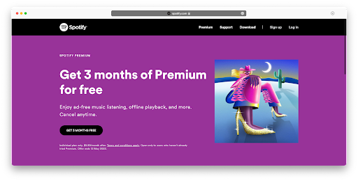
Finally, giving your potential customers a good deal will always translate into an effective CTA.
With the 50 examples above, you can see how power words like “start,” “free,” “now,” and “new,” among many others, can be combined in different ways to get your audience to take action on your website, social channels, or ads.
Going forward, challenge yourself to always include at least one power word in your CTAs and track the effect it has on your conversion rates. And if you want more copywriting tips? Check out our guide to writing sales copy that actually sells.