
The most effective way to sell something is to ask your target audience to buy it. It might seem obvious, but the truth is that most companies never make it a priority.
Businesses that invest in marketing provide lots of valuable information, from articles to reports to ebooks, but rarely ask for anything in return directly.
This is what an effective call to action (CTA) is for. Using call to action buttons not only helps increase conversions among potential customers, it also spikes conversion rates for occasional website visitors — you never know when someone is ready to buy your product or service.

Let’s see how you can write effective CTAs by reviewing 15 popular call to action examples that some of the most successful businesses out there are using.
What is a call to action?
In their book Call to Action: Secret Formulas to Improve Online Results (2006), Bryan Eisenberg and Jeffrey Eisenberg quite simply define all call to actions in terms of CTA buttons:
“A call to action is a hyperlink that moves your visitor through your sales process.”
Indeed, 90% of all call to action examples you see today are primarily online-based. Visit any website and you’ll see a CTA button in the top-right corner as well as one next to the hero image. Every form has a call to action button as well, and so do ecommerce items that you can “add to cart.”
All CTAs are meant to create a sense of urgency and move you along the conversion funnel. They are not necessarily about buying something. A good call to action example could ask you to “learn more,” “see all features,” “get a quote,” “watch demo,” “sign up for a trial,” and much more.
Analog-world CTAs are still part of marketing campaigns, especially for more established brands. You can see them on billboards, in TV ads and newspapers, as well as hear them on the radio. Anything from “ask your doctor today” to “come in for an assessment” is an example of a call to action.
Why do you need CTAs? More than anything, CTAs act as guides. Once you’ve given some information to your target audience, what should they do with it? CTAs are there to provide the next logical step and keep and keep your potential customers engaged from the very first interaction all the way through to repeat purchases.
15 call to action examples that get clicks
The secret to writing effective call to action phrases is basing them on action words (also called power words), such as:
- Free
- Now
- Best
- More
- Save
- Cheap
- Easy
We’ve written about using power words in depth before. Learning to leverage them in crafting any type of CTA will greatly improve your conversion rates.
Below, we’ll examine 15 great call to action examples by prominent brands that we’ve gathered from various landing pages, blog posts, email marketing, social media, Facebook ads and other sources.
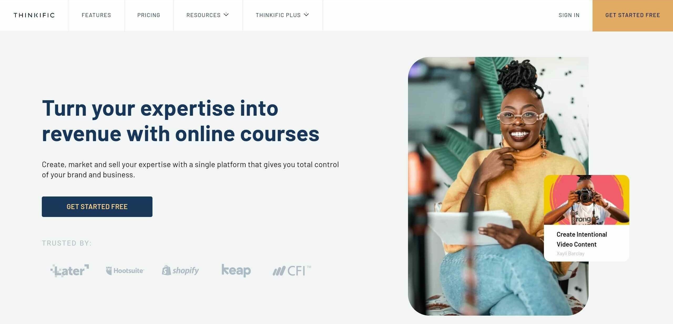
1. Thinkific: Get Started Free
One of the most popular CTAs for SaaS companies is “Get Started Free.” It’s concise, direct and uses “free” as a power word. There’s also just enough ambiguity — is the app free forever or only for a limited trial (e.g. 14 days)? Or is there a limited free tier along with paid tiers?
This CTA works for Thinkific because it’s a SaaS platform. There’s in fact a free tier for anyone who wants to see how to easily create online courses. And it also emphasizes taking action, especially when there’s no downside — it’s free, after all.
How to use “Get Started Free”
If you run a SaaS app and offer a free trial or tier, then “Get Started Free” is a good CTA to convert people. While you can also try to pick more creative CTAs to put in ads or throughout your website copy, “Get Started Free” works especially well in the navigation bar and other areas where space is limited.
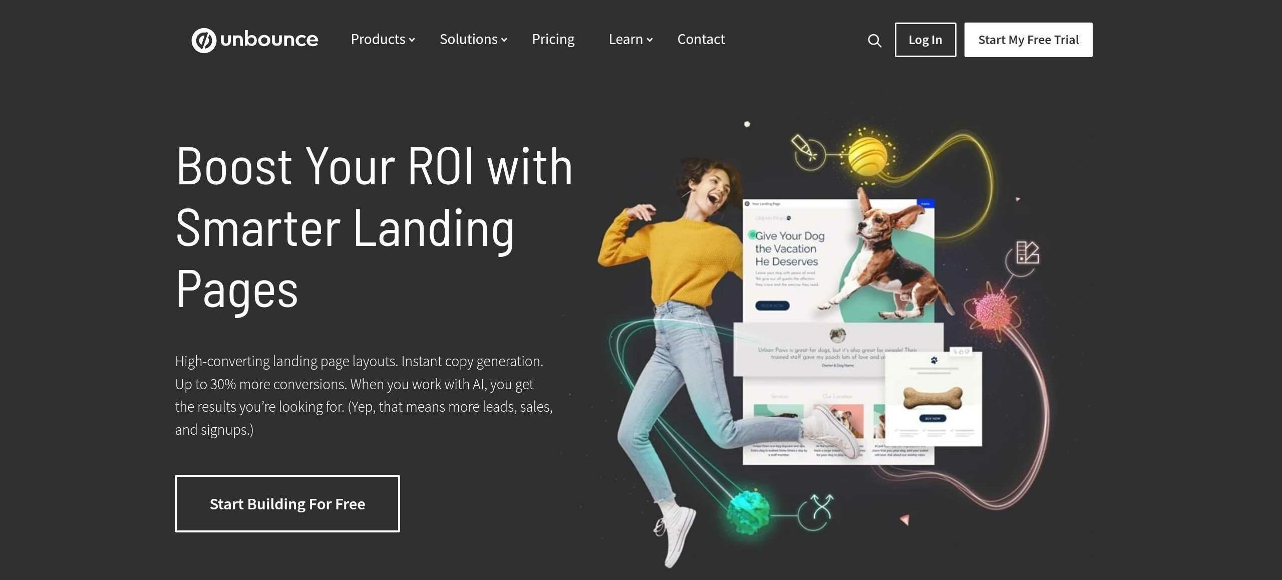
2. Unbounce: Start Building For Free
You might want to replicate the simplicity and power of “Get Started Free” but also customize it to better reflect your business.
For example, Unbounce — a platform for creating quick marketing landing pages with no code — uses “Start Building For Free” as their main CTA on the homepage. “Start” is a powerful word for generating action, while “building” gives more clarity to what would happen after you sign up.
How to use “Start Building For Free”
You can use the same construction in your own CTA, perhaps swapping the word “building” for something that suits your organization even better. “Start Creating For Free” or “Start Reading For Free” or similar all sound equally powerful.
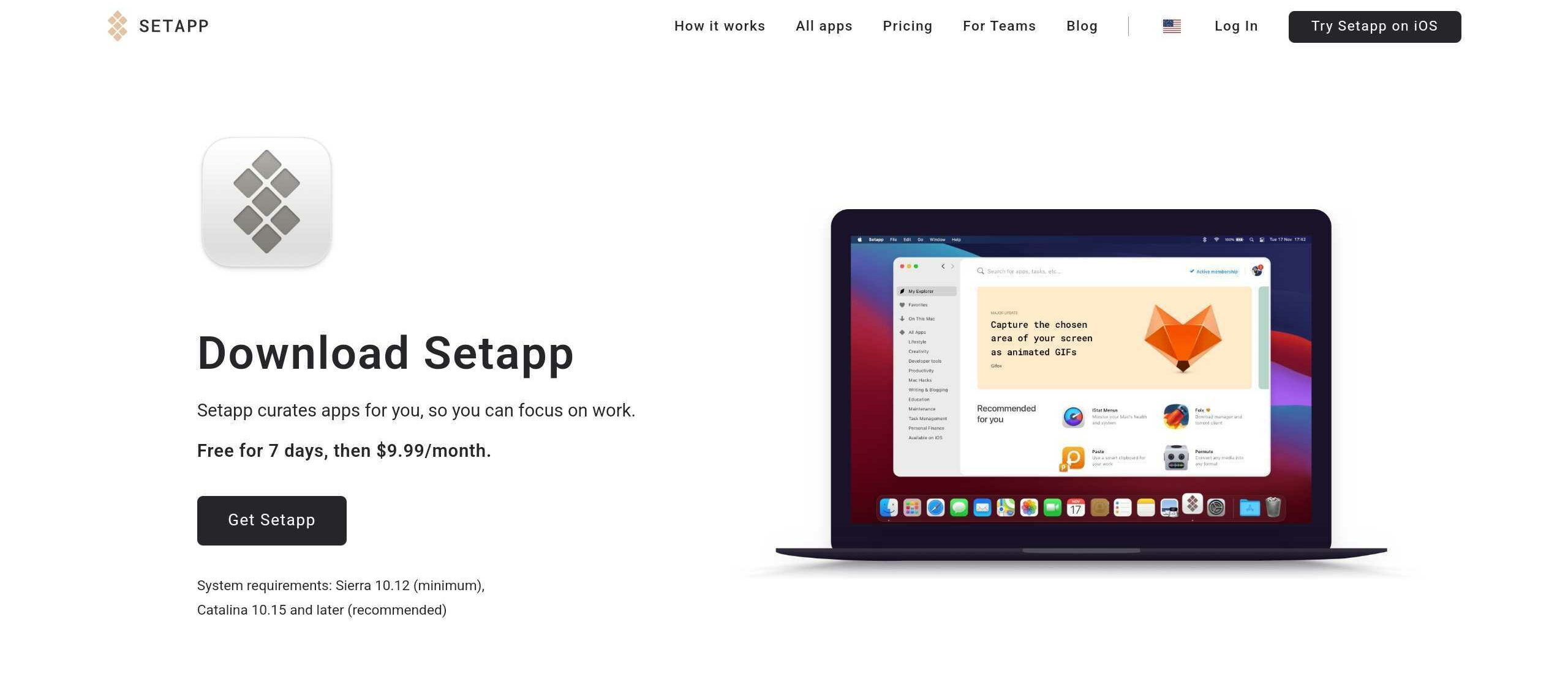
3. Setapp: Download Setapp
When you’re trying to improve conversions, the best course of action is to decrease the distance between the audience and the result you’re looking for.
Being a Mac app, Setapp decided to go for the straightforward “Download Setapp” and it works because visitors have enough context through the marketing website to decide whether this CTA is something they want to click or not.
How to use “Download Setapp”
The more effective your copy surrounding the CTA is, the more down-to-the-point your CTA will be. So make sure to explain the benefits of your app first and then you can ask your visitors to “Download [your app].”
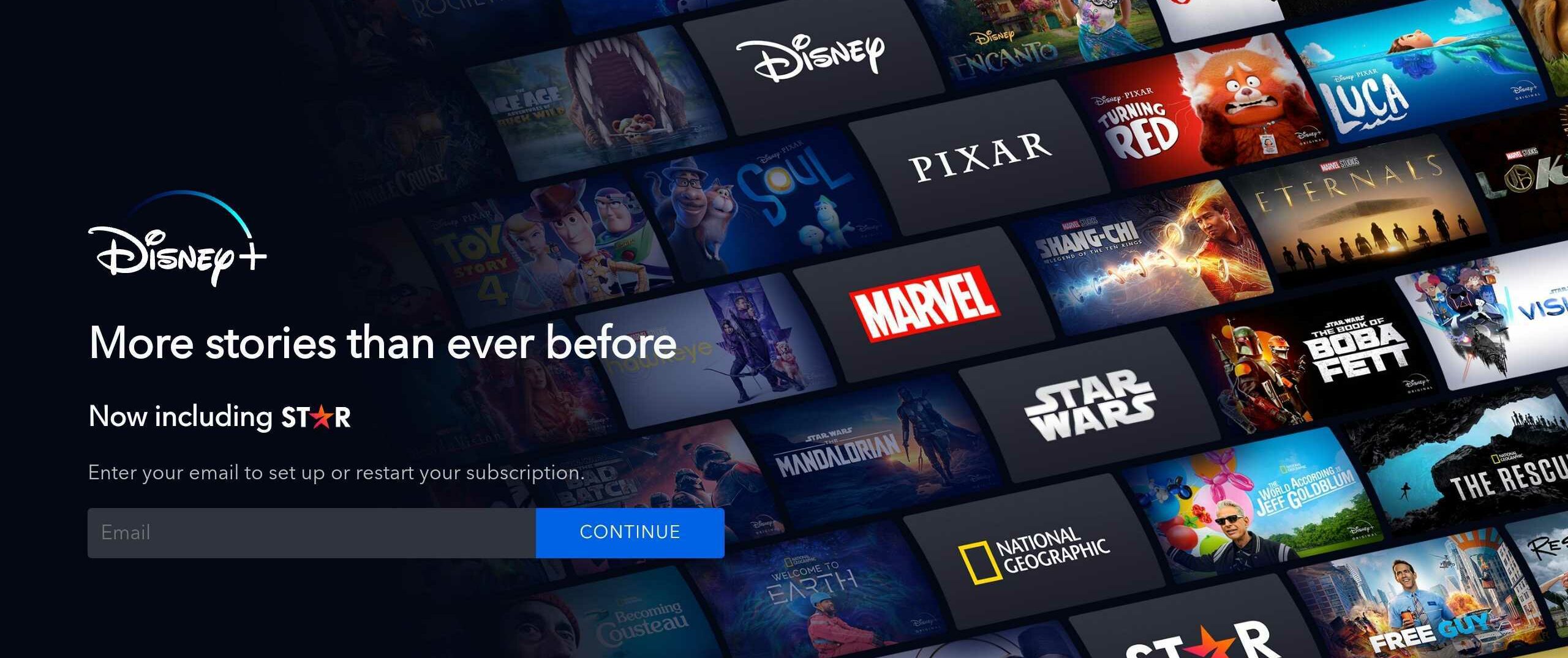
4. Disney+: Continue
If you don’t want to reveal too much about your product upfront, it’s possible to write a headline with a short intro. This serves as a hook to collect your visitors’ emails before giving more information.
The idea is that even if visitors don’t convert on the spot, you don’t lose the connection and can reach out to them via email later on.
Disney+ is also able to ask for email and have a “Continue” CTA partly because it relies on the brand trust of the parent brand that has been in the business for 100 years.
How to use “Continue”
You can experiment with the “Continue” CTA on landing pages which get “warm” leads, either from ads or other referrals, and who’ve already expressed some interest in trying your product.
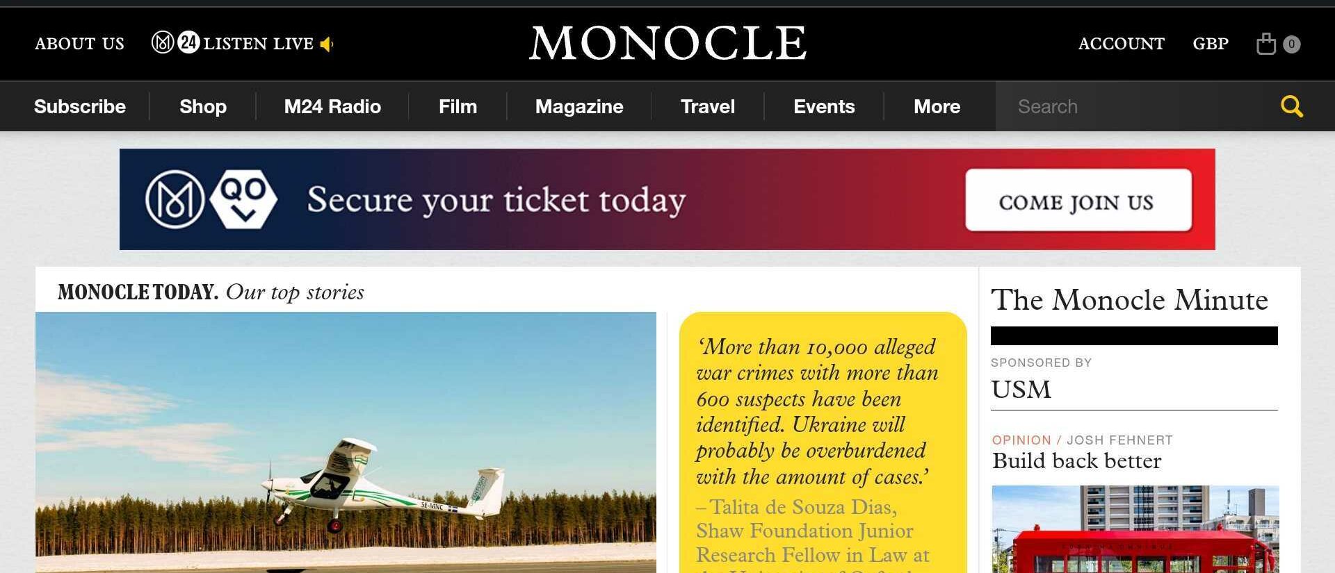
5. Monocle: Come Join Us
It’s possible to have multiple CTAs on information-dense webpages. In fact, your CTAs don’t even have to be the focal point — having a CTA that is secondary to your main goal is perfectly fine.
Take a look at Monocle and their “Come Join Us” banner CTA inviting visitors to attend a conference. Clearly, what Monocle wants the most is for visitors to subscribe to their magazine. But offering another option, whether it’s going to a conference or signing up for a newsletter makes it easier for visitors to choose something rather than leave with nothing.
How to use “Come Join Us”
What “Come Join Us” does right is highlighting the sense of FOMO (fear of missing out). A conference is happening, are you joining or not?
This kind of framing helps conversion rates by laying out a narrative rather than being technical about it.
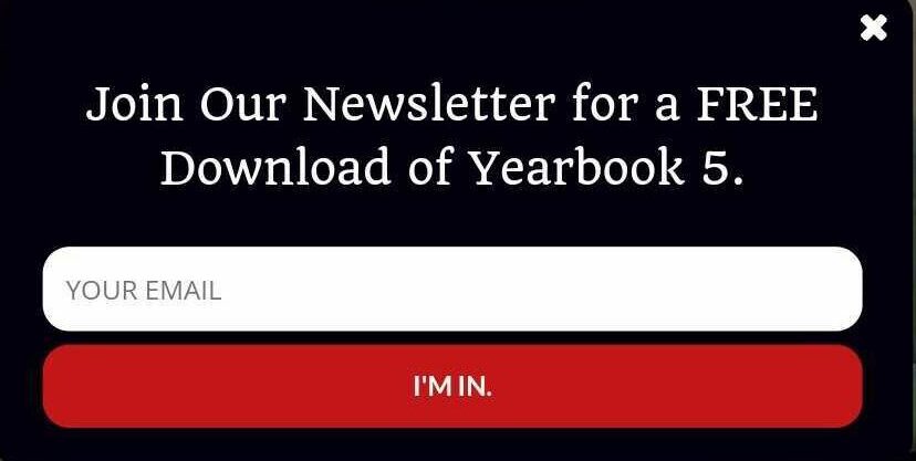
6. Hiut Denim: I’m in.
Another great CTA example comes from the Welsh brand Hiut Denim. They run a very popular newsletter and don’t publish online archives.
So, you need to sign up to get it. They make it seem like an exclusive club and underscore it with the affirmative “I’m in” CTA.
How to use “I’m in.”
CTAs like “I’m in.” show that you don’t always have to start every call to action with a verb. People already know that buttons are clickable. So this is an opportunity for you to say something creative that will draw the attention of your audience.
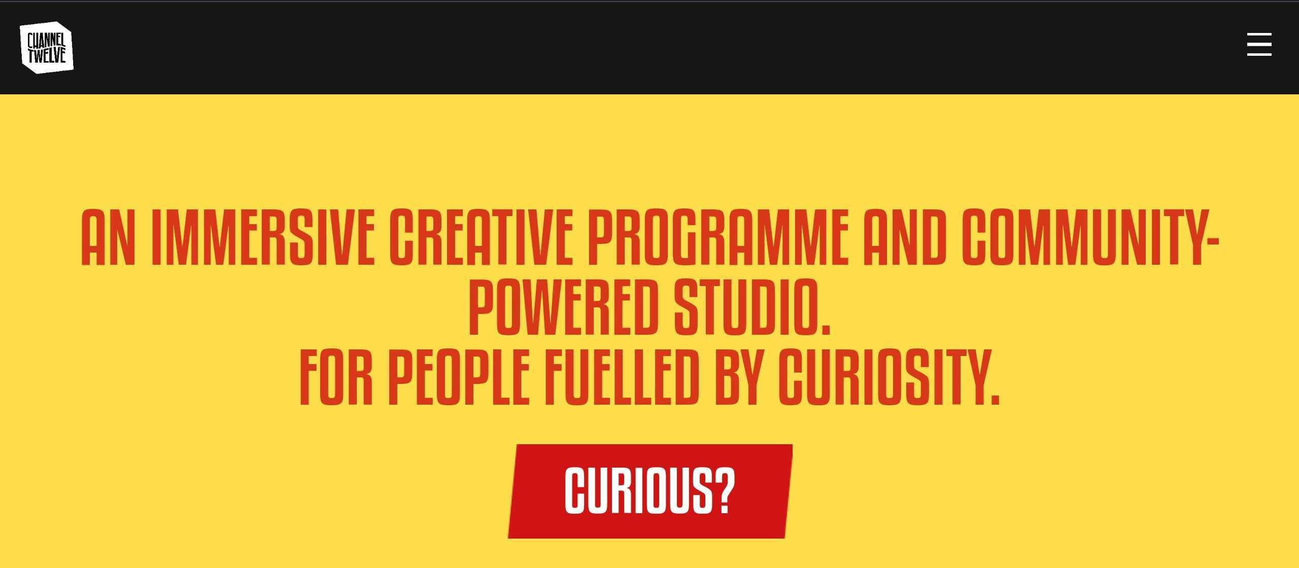
7. Channel Twelve: Curious?
The web is full of CTAs like “learn more” or “read more” that are mostly navigational in nature and take people to other webpages on the website.
Channel Twelve, a studio that powers creative community projects, went with “Curious?” instead after introducing itself in the header of their website. Unlike “learn more,” a CTA like “Curious?” has energy and momentum, and makes it much more likely that you’ll click it.
How to use “Curious?”
Asking questions to your audience in the CTA is an effective technique. Couple that with keeping the stakes low (not asking to buy your product right away) and you’ll get high conversion rates as a result.
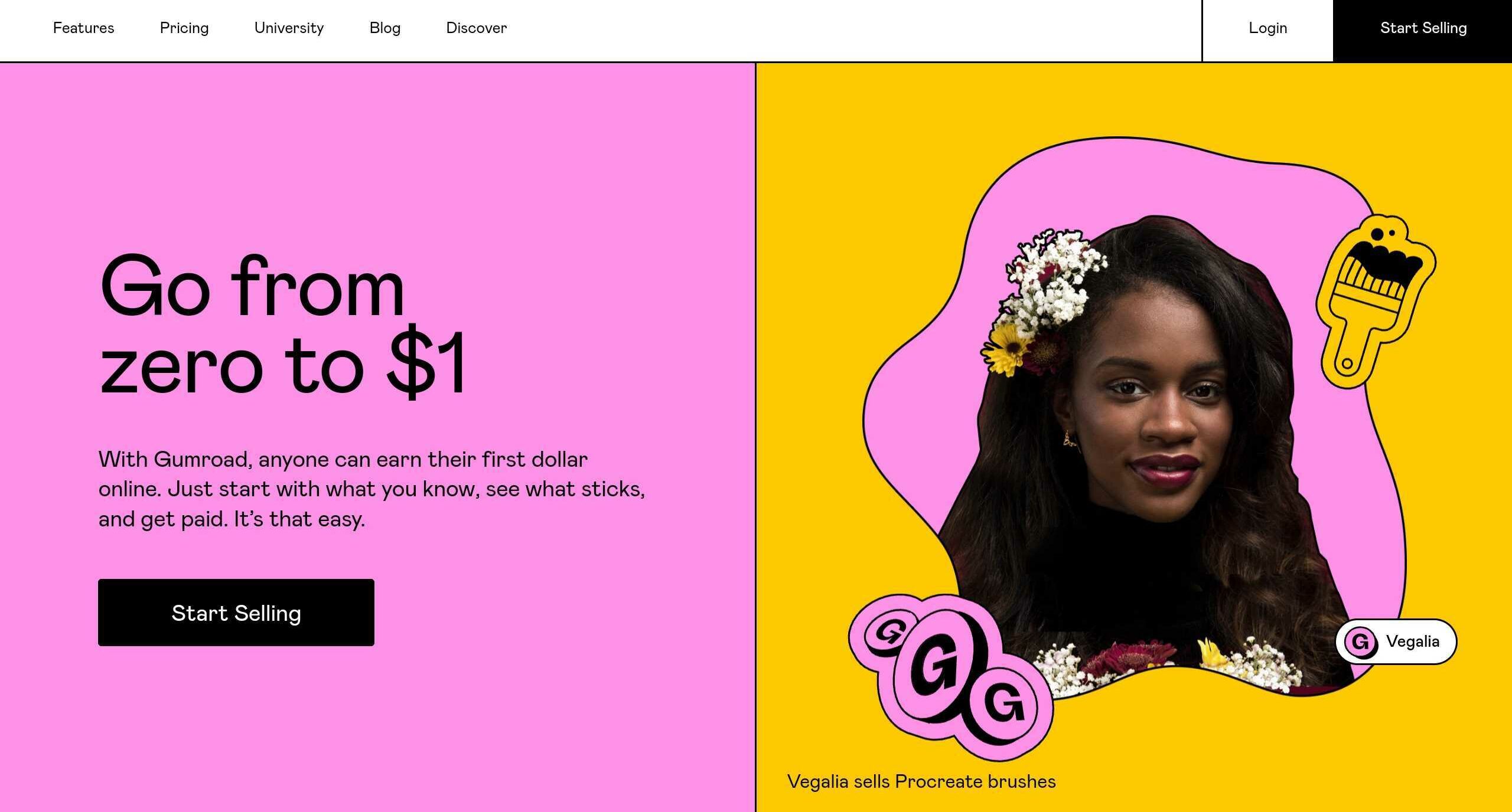
8. Gumroad: Start Selling
Gumroad is a platform to sell digital goods, anything from ebooks to online courses. With a “Start Selling” CTA, you can tell they are highlighting the ease of use, focusing on the needs of the audience and making the platform itself almost invisible.
How to use “Start Selling”
In your CTAs, think not in terms of what your product does, but what your audience gets out of it — what’s the benefits expressed in the most simple words? “Start Selling” is a good example to aspire to.
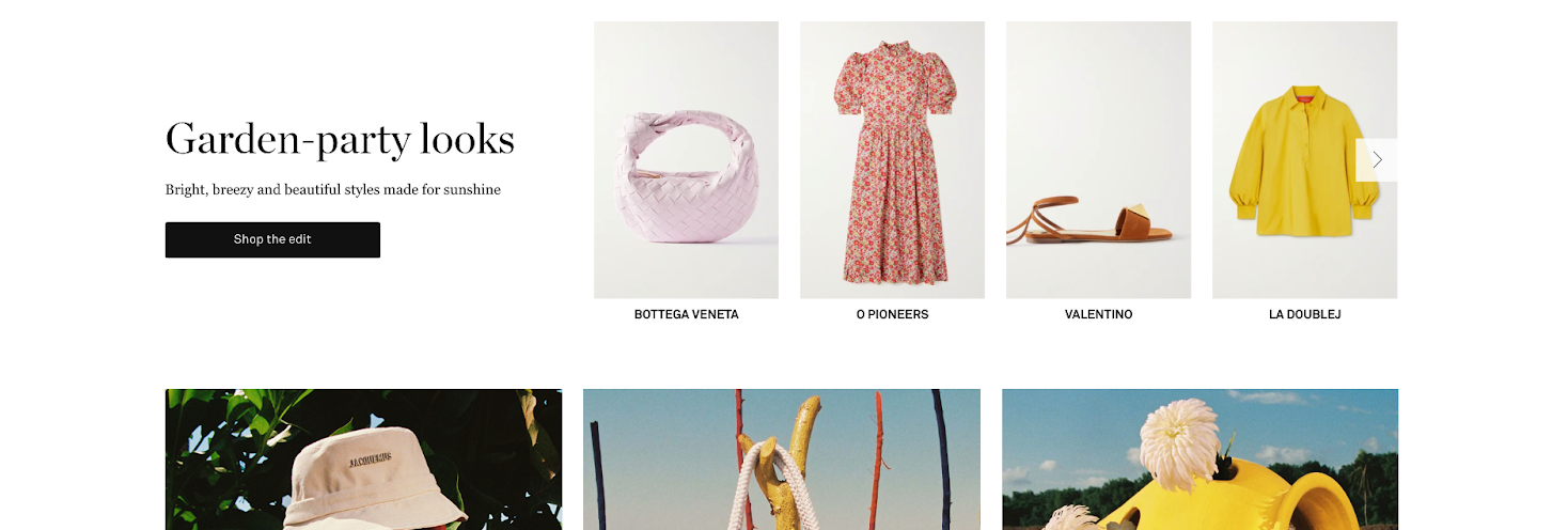
9. NET-A-PORTER: Shop the edit
As you can see, knowing your audience is one of the most important aspects of creating effective CTAs. NET-A-PORTER, one of the leading online boutiques for high-end womenswear, knows that its audience likes curation. So their team curates selections from the store and invites their audience to “Shop the edit,” which shows how well they understand the people who shop there.
How to use “Shop the edit”
In your own CTAs, think how you can personalize or make something easier for your audience. Maybe it’s showing use cases for your product, maybe it’s providing templates, or maybe it’s just inviting them for a personal demo.
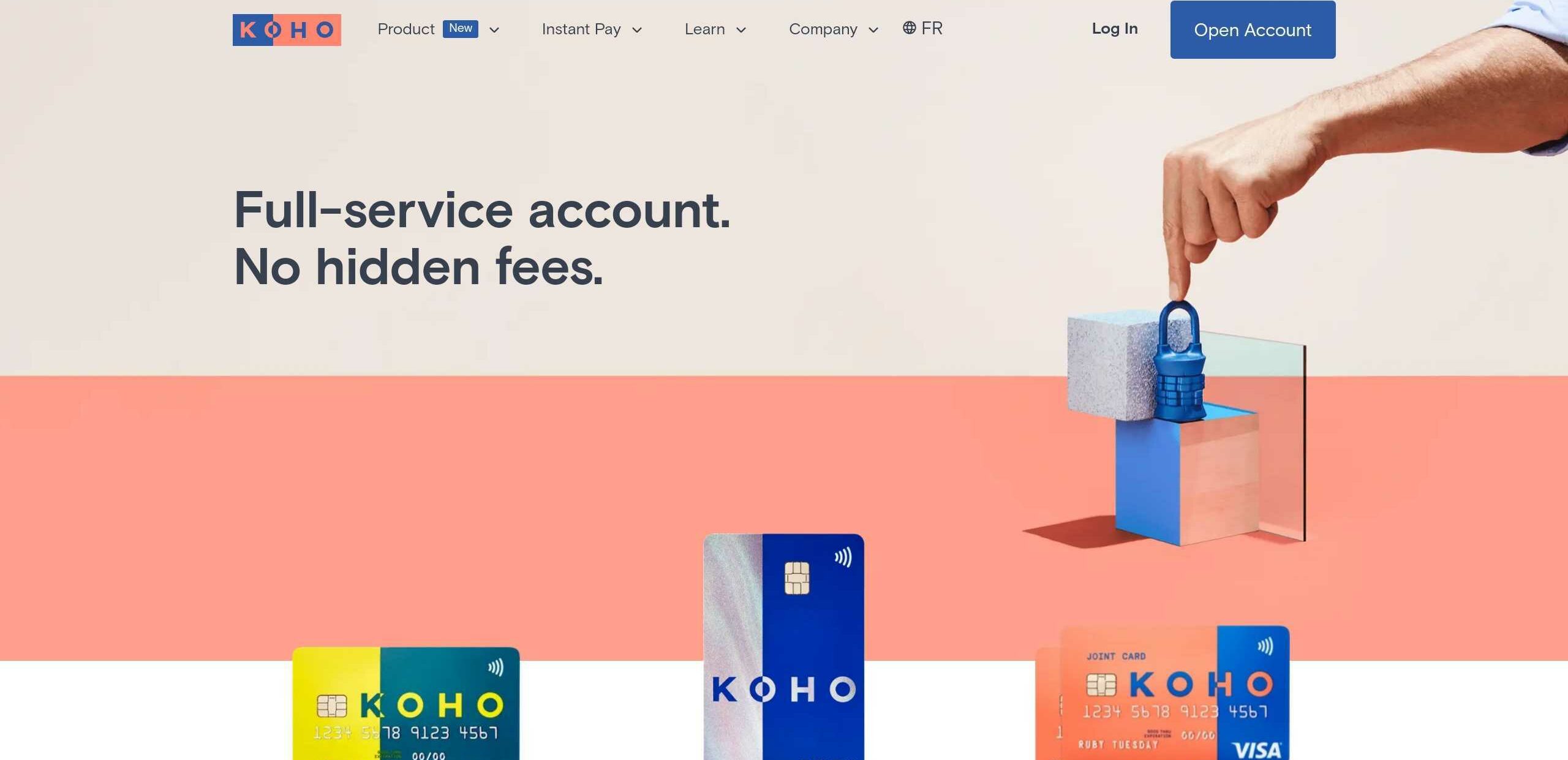
10. KOHO: Open Account
We’ve already mentioned that if the text on your marketing website carries most of the weight, your CTA can be quite direct.
KOHO, an online bank, highlights how easy it is to open a bank account. In fact, they make it seem so easy that nothing more than the “Open Account” CTA is necessary.
How to use “Open Account”
To use a CTA similar to “Open Account,” think of areas in your marketing where it’s beneficial to be as direct as possible. Then answer all potential questions in your copy and finish with a simple CTA.
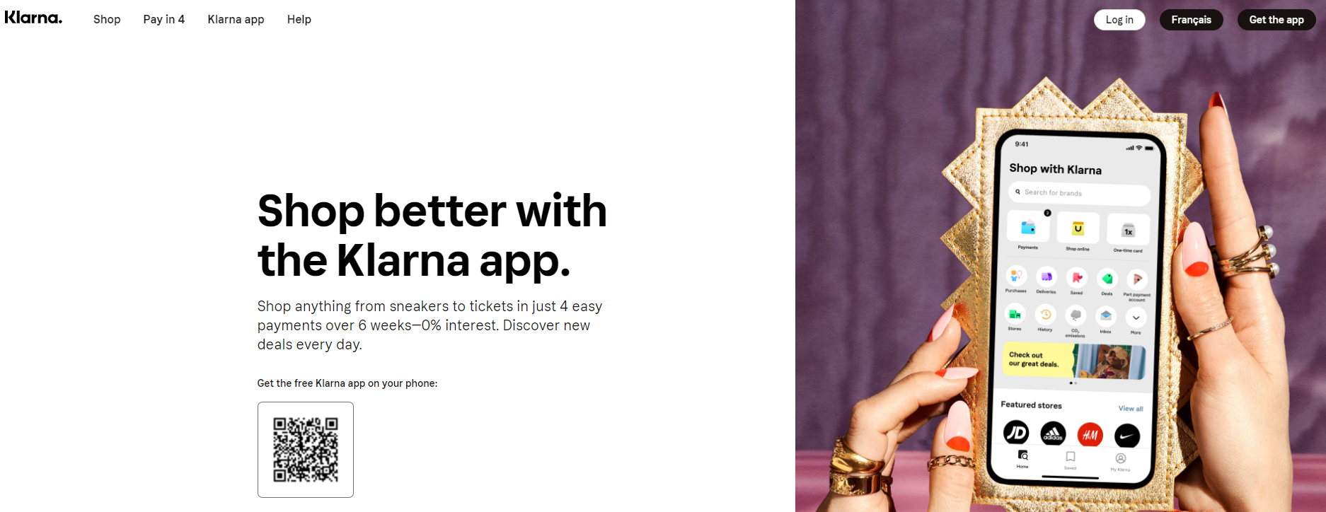
11. Klarna: Get the app
Klarna is a BNPL (buy now, pay later) solution that’s integrated into thousands of online retailers out there. So it’s likely that Klarna’s audience is already aware of the product without ever visiting its website.
Hence a CTA like “Get the app” can work because people coming to the website are already interested, and only a slight upsell or extra benefit is needed to persuade them to create an account.
How to use “Get the app”
Using the “Get the app” CTA works really well on webpages to which your visitors come with predetermined intent. For example, if you have a page that lists app downloads for all the platforms, using the “Get the app” CTA perfectly fits the intent of the audience.
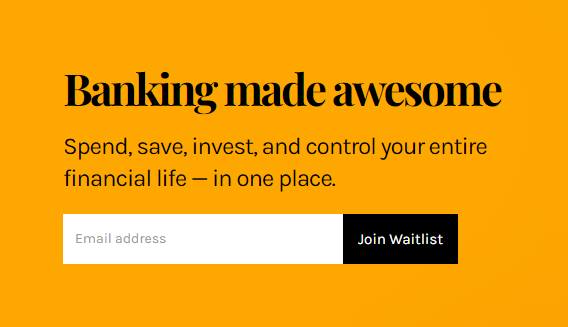
12. Neo-Bank: Join Waitlist
Neo-Bank is a new player in the online banking sector, and it hasn’t yet fully launched its offering to the public. So they are creating a waitlist of people who want to try their solution using the “Join Waitlist” CTA.
This is an effective CTA because it leverages the desire to be the “first to try” in exchange for an email address that could be used for higher conversions later.
How to use “Join Waitlist”
The lesson for companies here is not to delay launching the marketing side of the product or service. Even if your product isn’t ready yet, you can create excitement around it and build your audience first with CTAs like “Join Waitlist.”
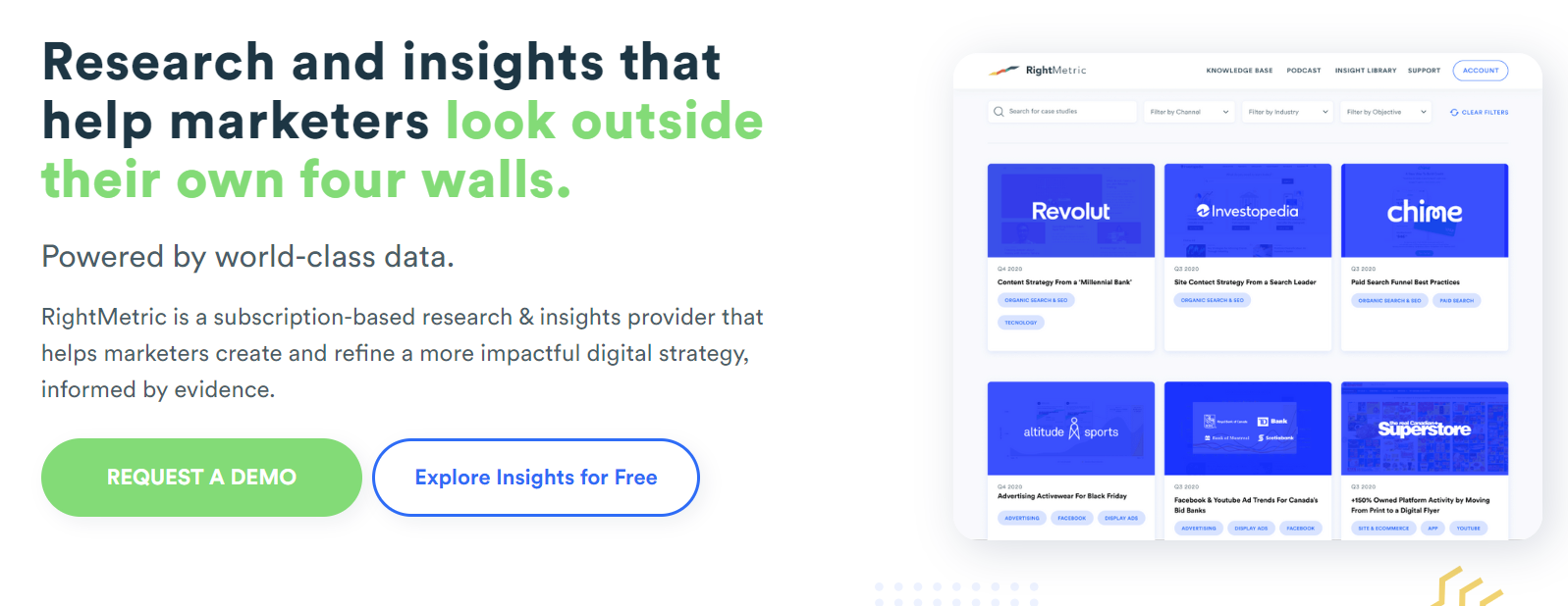
13. RightMetric: Explore Insights for Free
When you visit websites for most B2B solutions, you’ll inevitably get the “watch demo” or “request demo” CTAs that will ask you for your email and other information, etc. It’s increasingly becoming a hard sell.
RightMetric, a B2B research provider, decided to keep the “Request a Demo” CTA but also add an easier option of “Explore Insights for Free” that doesn’t require surrendering any information from the user. This technique makes it less likely for visitors to bounce, since they might explore the insights first and, hopefully, decide to sign up for a demo right after.
How to use “Explore Insights for Free”
Think about the CTAs you have on your website right now. Are they asking too much from your visitors? Consider adding an extra CTA that can serve as a step to the original CTA and smooth out the conversion process.
14. Klue: See Klue in Action
One of the most attractive CTAs in the B2B market is to be able to watch or test the solution before having to commit to anything.
Klue uses this idea in its “See Klue in Action” CTA. You know that a lot of visitors would rather dive right in and click the CTA than read through all the text on the marketing website. So this is the type of CTA that really draws attention to itself.
How to use “See Klue in Action”
If you have the ability to give visitors access to the demo version of your product, then using “See [your app] in Action” can be very powerful.
However, make sure to avoid putting too many hurdles for your visitors. Including asking them to fill out long forms before they can actually get to the product, since it might completely negate the increased conversion effect of the CTA.

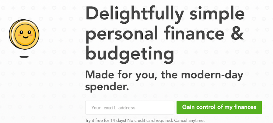
15. Lunch Money: Get control of my finances
Another great CTA technique is reiterating the benefit of your product in the CTA itself, even when it makes the CTA button longer than people are used to.
For example, Lunch Money, a budgeting app, uses a few revolving CTAs on their sign up form, one of which is “Gain control of my finances.” This is both something that Lunch Money visitors are looking for and that the app actually provides. Great fit!
How to use “Get control of my finances”
To emulate Lunch Money, look at your unique value propositions and experiment with changing them to look like a benefit wrapped in action. If you’re running a fashion retailer, for example, it could be “Discover curated summer collections,” and so on.
Should I include a CTA button?
Hopefully, scanning through all the CTAs above, you now have more than enough inspiration to create a list of your own.
You might see some debate online about whether CTAs are actually necessary. After all, if your audience wants your product, they’ll find a way to buy it, right?
Well, technically, any button that says “Buy” or “Subscribe” is also a CTA, so there’s no way around using them!
In reality, what you have control over is the amount of CTAs on your website and marketing materials. You don’t have to pollute your website with CTAs. At the same time, not presenting your audience with the next logical action is confusing — why make it more difficult than necessary for your audience to convert into customers?
Use CTAs judiciously. A general rule is that you can use a CTA every time you’ve fully explained a use case or a benefit that would be enough for someone to go to the next step. At minimum, you should have one CTA at the top of the webpage and one at the bottom.
You can also think about the design hierarchy of your CTAs. Not all CTAs are created equal. Some are part of your website navigation; some take you to third-party solutions; some exist just to explain your solution in more depth.
So make sure your primary CTA is distinct from the rest. Then style secondary CTAs differently but still in a way that they don’t get lost. And leave tertiary CTAs on the same level of visibility as links.
How to create a CTA for your online course?
Lots of creatives, schools, entrepreneurs and companies create online courses nowadays, using course-building platforms like Thinkific.
A landing page for your online course is the perfect environment to experiment with different sales copy directions as well as effective CTAs.
Start with a few primary CTAs, using verbs like register, buy, sign up, subscribe, get or even something more specific to user benefits.
Augment the primary CTAs with secondary ones. For example, you can invite people to check out your curriculum, watch a demo lecture, see a trailer, look at testimonials and more.
Finally, sprinkle some tertiary calls to action that wouldn’t lead to people buying your course immediately, but will keep them connected. Some examples are signing up for a newsletter, following on social media, subscribing to a podcast, etc.
As for the process of course creation, Thinkific makes building your online course a quick and fun experience. You don’t need to know any coding at all — just use a variety of templates as well as an intuitive drag-and-drop editor to create any design you want.
Get started with Thinkific for free and create your first online course today.