If you’re going to the trouble of creating a webinar to entice new customers, you need a webinar landing page to go with it.
A webinar landing page is the place where you’ll encourage new sign-ups and let your audience know what they can expect from your webinar – and why it’s too good to miss!
Keep reading to find out how to create the best possible webinar landing page, plus real-life examples of webinar landing pages that work.
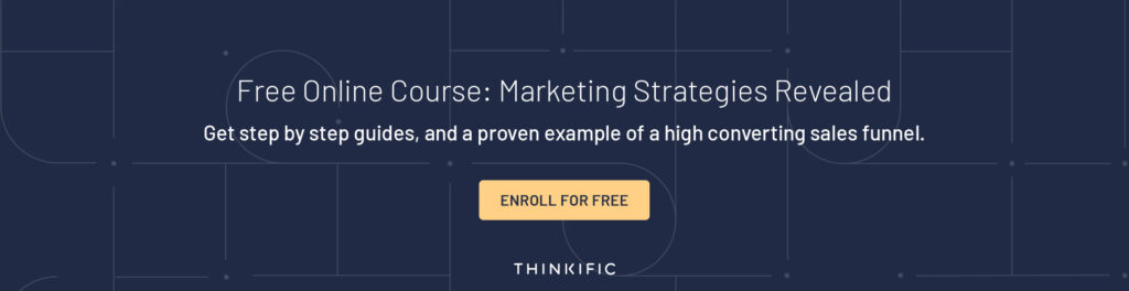
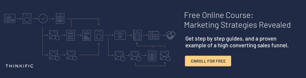
For top tips on how to use webinars to boost your conversion rates – sign up for our Free Webinar Sales Funnel course.
What to include in your webinar landing page
When you’re writing your webinar landing page, both the design and the content count. Your webinar landing page needs to be easy-to-read, eye-catching and include a clear Call-To-Action (CTA).
Think about your webinar landing page like a journey. Each section of your webinar landing page should build on the last as you move your reader through your page. The last step of your journey is your sign-up form – it’s the pot of gold at the end of the rainbow!
If you’re ready to create your webinar landing page, check out these 5 tips for what you need to include…
1. A powerful headline
The best webinar landing pages all have one thing in common – a clear headline that immediately catches the reader’s eye.
Rather than simply introducing your webinar, your headline banner should tell your reader what they stand to gain from signing up.
Here are some tips for writing an awesome headline:
Use action words
When you’re writing your landing page headline, use action words to motivate your reader. High energy action words can give your audience a boost of enthusiasm. They increase the anticipation and excitement around your brand.
Check out these action-packed examples:
- Enter
- Access
- Get
- Inspire
- Deliver
- Impact
- Connect
- Launch
- Start
- Go
Every one of these words is high energy. When you read them, you want to take action. They’re words that are embedded in our brains to make us do things. Take advantage of this when you’re writing your headline.
Remember – keep your language simple. Make sure that your headline is written in a way that anyone can understand. This is not the time for using your thesaurus!
Include numbers, data and statistics
Got an impressive statistic you can use in your headline? Do it!
Whether you’ve helped someone get amazing results, you’ve had a record number of sign-ups or you’ve gained huge profits from using your method, if you’ve got a statistic you can use in your headline then put it in. Numbers, data and statistics can all grab your audience’s attention and spark their curiosity.
This is a great way to make your webinar really stand out.
Borrow a quote from a customer
If there’s a word or phrase in your testimonials that really packs a punch, try using it for your webinar landing page headline.
Borrowing words from your customers can make your headline more impactful and give it a personal touch.
2. Introduction to you
Another important part of your webinar landing page is an introduction to you and your brand.
When it comes to boosting attendance for your webinar, this is especially important. As you’ll be hosting the webinar and speaking directly to your audience, they need to know who you are.
Introduce yourself with:
- A friendly headshot
- Your name
- A personal message
- More about your experience
Brands will often use a signature along with a photo to increase that personal feeling. If you can see someone’s handwriting next to their face, it cements the idea that there’s a real person behind the business.
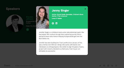
Check out how Fiverr uses speaker headshots and bio pop-out boxes to give their audience more details on who will be leading the webinar:
3. Your webinar overview
As well as writing a killer headline and introduction to you and your brand, you also need to let your reader in on what to expect from your webinar!
Who it’s for and what it includes
To help your audience make a decision about whether or not to sign-up for your webinar, it helps to outline who your webinar is for and what you’ll be talking about.
In this section of your webinar landing page, it’s really effective to use a simple ticklist of pain points and desires that your target audience has. This allows your reader to identify if your webinar is right for them.
It’s also a good idea to include a brief outline of what you’ll cover in your webinar. Generate excitement by making your outline catchy and high energy. Use action words again and make sure you include the benefits.
Check out this format in action on Later’s webinar landing page:
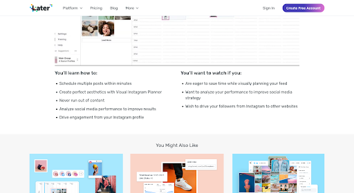
Find out more about Later’s Thinkific success story here.
Make it scannable
Another essential step to creating an effective landing page is to make it scannable.
One of the worst mistakes you can make is writing your landing page like an essay, with blocks of text laid out in paragraph format. Though you might have a lot to say in this section of your webinar landing page, it’s really important to be restrained. Focus on the highlights!
To get people to read your landing page, use every readability trick at your disposal, including:
- Subheadings
- Bullet points
- Numbered lists
- Icons
- Boxes
Remember – your webinar landing page should be visually interesting. If you cram your page with dense text and nothing else, you’ll quickly lose your audience.
Use trigger words
When it comes to writing a high converting webinar landing page, trigger words can be your secret weapon.
Trigger words are designed to generate emotion in your audience.
If you can use trigger words that are personal to your reader – words that touch on their pain points, challenges and fears – you can make your webinar copy speak directly to them.
When you’re writing your webinar outline and emphasizing who your webinar is for, make sure you use trigger words to drive the message home.
Download Neil Patel’s free trigger words worksheet and find your audience’s trigger words
4. Social proof
When you’re writing your webinar landing page, make sure you add social proof to your body copy.
Social proof is a really effective way to make your webinar landing page engaging and enticing for readers. It also demonstrates to your audience that you have authority and you’re a brand they can trust.
Here’s some ideas for social proof to use on your webinar landing page:
- Testimonials
- Brand logos
- Case studies
- New sign-up pop-ups
- Certifications and business credentials
Using a combination of different forms of social proof works really well. Try to use at least 2-3 forms of social proof on your webinar landing page.
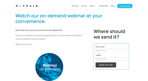
Here’s an example from Thinkific partner Motrain’s webinar:
5. Definitive Call-To-Action
Your webinar landing page will be useless without a Call-To-Action (CTA).
A CTA is designed to direct your audience towards a certain action – in this case signing up for your webinar.
Include a CTA at the top of your landing page and at strategic points throughout your body copy. You also need to include one at the end to catch readers who have followed your landing page from start to finish.
Make your CTA super clear and direct. It is helpful to use personal words like “you”, “your” and “my” to give your CTA more impact.
Check out these examples of successful webinar landing pages to see these tips in real life.
5 webinar landing page examples
Curious to see these tips in action? Here are 5 real-life examples of webinar landing pages that convert readers into viewers. Let’s break down what works and what could be improved for each of them.
1. Hootsuite
Hootsuite’s webinar landing page example
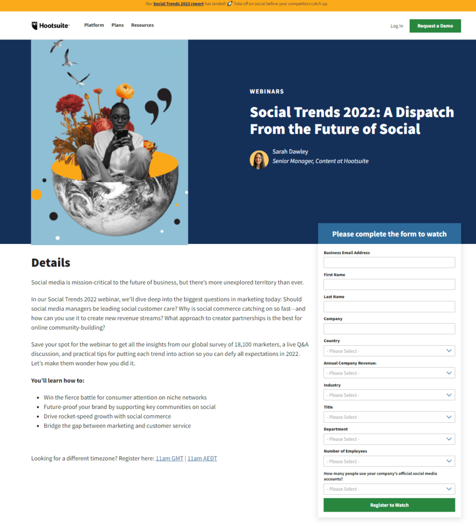
What worked:
- Asks questions – This webinar landing page builds up the reader’s interest in the topic by asking questions. The questions hint at what’s to come in the webinar while sparking curiosity.
- Lists highlights – In the body text, this webinar landing page also includes the highlights of what ‘s included in the webinar – “insights from our global survey of 18,100 marketers, a live Q&A discussion, and practical tips for putting each trend into action” – this short paragraph gives the reader an insight into what they can expect to learn.
- Includes learning objectives – Bullet points are used to show off the webinar learning objectives. Hootsuite uses compelling sales copy and energetic words like “fierce battle”, “future-proof” and “rocket-speed growth” to generate excitement.
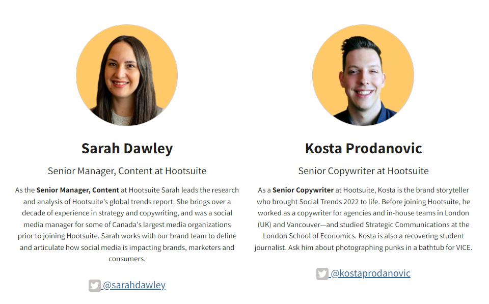
- Introduction to the speakers – The speakers’ bios are added to the landing page to give authority to the webinar. The reader gets their names, position in the company and experience, as well as a smiling professional headshot and link to their Twitter account.
- Social share buttons – Readers are given a clear CTA – “Share This” – with social share buttons to encourage them to spread the word about the event. This is an easy way to boost engagement and encourage more traffic to the webinar landing page.
How it could be improved:
- More descriptive imagery – This webinar landing page is visually interesting but the hero image doesn’t do much to support the topic being discussed. A different image choice could work better here. This is something that could be explored using A/B testing.
- Add social proof – This webinar landing page is missing social proof to make it even more enticing to viewers. Testimonials or viewer statistics could help to elevate this landing page to the next level.
- Lengthy sign up form – The registration for this webinar includes multiple questions that some registrants might not want to disclose. To avoid losing potential attendees, the sign-up form could be simplified. Any additional questions can be asked later as part of a post-registration customer survey.
2. Exposure Ninja
Exposure Ninja’s webinar landing page example
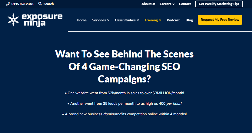
What worked:
- Leads with a question, and a results based subheading – A strong question is put right at the top of this webinar landing page. The wording builds excitement and that’s backed up by the bullet point subheading below. Exposure Ninja focuses on the results that successful businesses achieved and that immediately fires up the reader’s imagination. These results-based subheadings are a really effective use of facts and figures that compel the reader to keep scrolling.
- Emphasis on FREE – The word free is capitalized to make it jump out in the sentence and reinforce to readers that they can get their hands on this webinar at no extra cost.
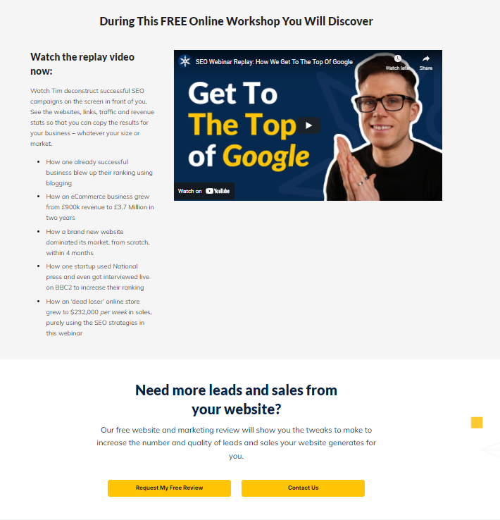
- Multiple success stories – This webinar landing page focuses on success stories in its overview of the webinar. It lists them as bullet points, repeating “How” to give the reader the impression that they’ll gain useful, actionable tips if they watch the webinar.
- Social proof banner – At the bottom of the page, Exposure Ninja has included a banner with their awards and partnerships with the heading “We’re Recognised By”. This social proof gives the brand more authority. The thinking goes – they’ve been shortlisted for awards so they must be good at what they do.

How it could be improved:
- Unnecessary navigation bar – Directly below the headline and subheadings there’s an unnecessary navigation bar that encourages readers to click off the page. The reader already knows that name of the webinar, it doesn’t need to be repeated here. This is just wasting space.
- Space dedicated to webinar schedule – There’s also a lot of landing page real estate used for the ‘webinar schedule’. As this webinar is available to watch at any time, a schedule isn’t needed. It would be better to use this space to give the reader more information on what the webinar includes instead.
- Different headshots – Exposure Ninja has included a headshot of ‘Head Ninja’ Tim Cameron Kitchen and repeated the same headshot next to it. Two different headshots or an alternative second image might be better here.
3. Semrush
Semrush’s webinar landing page example
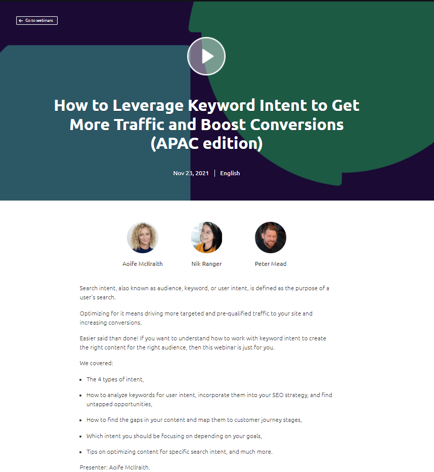
What worked:
- Strong, clear headline – The headline of this webinar landing page tells the reader exactly what the webinar will be about and includes two benefits that the audience stands to gain from watching.
- Essential information at the top – Listing the date, time and language lets the reader understand immediately if they will be able to attend. This is especially important for live webinars and events.
- Use of speaker headshots – Photos give the reader an instant personal connection to the webinar speakers. This is reinforced by the use of their names and a clickable link to their bio and social channels.
- Minimal text – With this minimalist format, the reader isn’t overwhelmed and the page looks clean and sleek. This is in keeping with the Semrush brand identity.
- Note on webinar recording – The addition of a warning that the webinar recording will only be available to registrants clarifies that any interested readers need to sign-up for the webinar. There won’t be a chance to view it any other way so this message adds a sense of urgency.
How it could be improved:
- More detail – This landing page is detail light so there’s not a lot for interested viewers to learn about. There are a lot of questions that go unanswered.
- Who the webinar is for – The body copy could be improved by listing who the webinar is for so that readers have the chance to identify if they’re the target audience for this webinar.
- Stronger Call-To-Action – The CTA for this webinar landing page is lackluster. While “Register” is a simple CTA, it could be improved with more urgency to drive the reader towards taking action.
4. Airmeet
Airmeet’s webinar landing page example
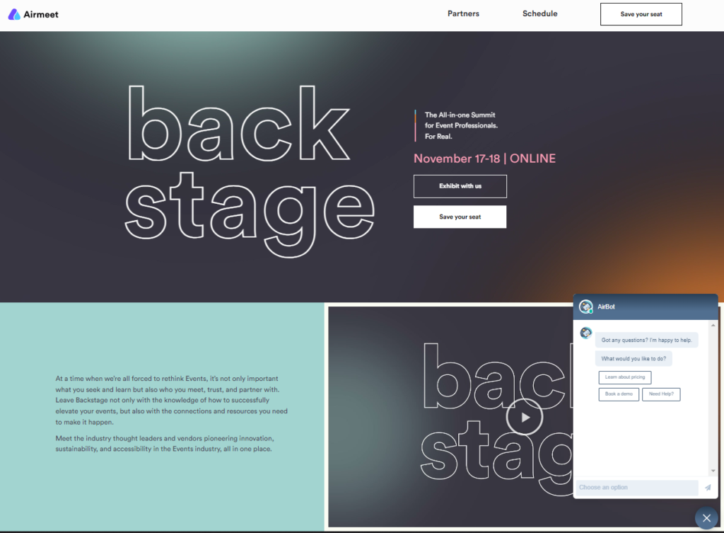
What worked:
- Visually interesting design – The first thing that hits you with this landing page is the visually interesting design with bold typeface and moving background. The eye is also drawn to the extra clear CTA that’s picked out in a white box.
- Mix of text and video – Airmeet combine text and video on their webinar landing page to cater to different audiences. Watch the embedded introduction video to learn more about the event or scroll through the page. Here readers have the option to do both.
- Social proof – Something that certainly isn’t missing from this landing page is social proof. Airmeet utilizes the brand logos of their exhibitors and images of their past guest speakers to give the brand and the event more authority.
- Countdown clock – A real-time countdown clock directly below the webinar introduction shows viewers exactly how long they have to sign up for the webinar. This countdown clock isn’t just in days or hours either – there’s a second-by-second countdown that really makes you feel like time is running out.
- Clear CTA – As this webinar is a conference with multiple guest speakers, there are two CTAs on the page – one to encourage attendees to “Save your seat” and another for businesses to “Exhibit with us”. The wording is clear and direct.
How it could be improved:
- Outline of what to expect – The only information the reader has about what the event contains is the headlines listed under ‘Day One’ and ‘Day Two’. As these titles aren’t very descriptive, their audience is left wondering exactly what the webinar will include.
- Addition of speaker bios – Having the headshots and names of the speakers is really effective – but it could be even better with a few lines about who they are.
- Testimonials – As we know there have been previous events like this one, this landing page could benefit from adding some testimonials from past attendees to convince their webinar audience that it’s worthwhile attending.
5. MarketingProfs
MarketingProfs’ webinar landing page example
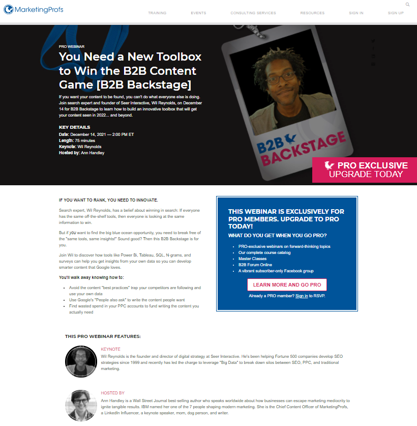
What worked:
- Assertive headline – This webinar landing page kicks off with a strong headline. The words “You need” are assertive and add urgency.
- Simple body text – The text on this webinar landing page is simple. There’s no danger of the reader getting bogged down in text-heavy paragraphs. The design is clean and clear.
- Focus on “You” – Throughout the webinar landing page, there are multiple references to “You”. This helps the sales copy feel more personal and like it’s targeted directly at the reader.
- CTA that stands out – Using a pink CTA in the top banner and a blue box in the body text helps the CTA to stand out from the page and draws the eye to those points.
- Limited navigation – There are few opportunities for the reader to click off this webinar landing page. The only interlinking is for the CTA. This helps to limit distractions for the reader and encourages them to stay longer.
How it could be improved:
- Add subheading – This webinar landing page is calling out for a results-led subheading that demonstrates how the “toolbox” will help webinar viewers “win the B2B content game”. A fact, statistic or just more detail is really needed here.
- Needs clearer language – Though there’s not a lot of text on this page, it is somehow still confusing. The language MarketingProfs use in their sales copy could definitely be clearer and more concise to help the reader know exactly what they’ll be learning if they watch this webinar.
- Refine the CTA – While the CTAs on this page are clear, the wording could be improved. While “upgrade today” adds a sense of urgency, the CTA to “Learn more and go pro” lacks impact. This webinar landing page could benefit from A/B testing to refine the CTAs further.
Use a webinar landing page to get more sign-ups and boost attendance
If you want to use webinars as part of your sales funnel, it’s really worthwhile to create dedicated webinar landing pages.
Your webinar landing page is your chance to show your audience what’s in store if they sign up. It’s also a golden opportunity to sell your brand and kick-start your sales process.
The best part? As you can see from these webinar landing page examples, creating your webinar landing page doesn’t have to be a complicated process.
For more top tips on how to market your webinars and your business, sign up for our Free Webinar Sales Funnel course.