

As a manager or training coordinator, knowing whether a learner finished your course isn’t enough. You need a clear picture of how your learners are moving through the program: who’s keeping pace, who has stalled, and who needs a hand.
The problem is, if you don’t have a dashboard that shows that picture at a glance, you have to build it yourself. That means pulling graphs, charts, and numbers from different reports and piecing them together by hand. According to Thinkific’s 2026 Industry Benchmarks Report, 41% of organizations say they can’t connect their learning data to their business systems at all, making manual report-building not just tedious but structurally unreliable.
That comes with two major problems:
- It takes a lot of time, and you have to redo it often. By the time you notice someone falling behind, the window to step in may already be gone.
- The details come from different sources, so the picture you end up with can have gaps. You might make decisions on incomplete data without realizing it.
A learner progress dashboard solves this.
In this article, you will learn what a learner progress dashboard is, which metrics to track on it, how to act on its insights, and how to report your findings depending on who is asking.
Skip ahead:
- What is a learner progress dashboard?
- The KPIs you should track on your learner progress dashboard
- How to use progress data to catch (and fix) problems early
- How to report learner progress to different audiences
- What an effective learner progress dashboard looks like
- Track learner progress in real time with Thinkific
What is a learner progress dashboard?
A learner progress dashboard is a centralized visual interface that tracks educational and training metrics in real time.
More specifically, it provides educators, managers, and administrators with a single, live view of how learners are moving through their program: where each person is right now, how far they’ve gotten, how they’re doing on assessments, and how active they’ve been. This allows them to monitor engagement, track completions, and identify learners who need additional support.
A dashboard like this changes the point at which you discover problems. Training reports often tell you who fell behind after it’s already happened, while a live dashboard shows you who’s stalling while there’s still time to do something about it.
Learner progress dashboard vs. Completion dashboard vs. Training report
It’s easy to conflate these three, but they’re not the same thing.
- A completion dashboard answers one question: Did the learner finish, yes or no? It’s useful for tracking who got to the end of the program, but it tells you nothing about how they got there or how they’re doing along the way.
- A training report is a snapshot you pull on a given day. It’s good for a point-in-time summary, but it starts aging the moment you generate it, since it doesn’t update as your learners keep working.
- A learner progress dashboard updates as your learners go, so you can see where everyone is in real time. It covers the learners’ entire journey rather than just the finish line, allowing you to step in early when issues arise.
In short, completion dashboards and training reports both look backward, while a progress dashboard keeps up with your learners as they get through the program.
Read: How To Boost Online Course Completion Rates In 4 Easy Steps
Progress vs. performance
Tracking learner progress isn’t the same as tracking learner performance.
Progress measures how far along someone is, while performance measures how well they’re doing. For instance, a learner can be 90% through your learning program and failing every assessment, or halfway through and acing every assessment. Both numbers matter, but they answer different questions, and ideally you want them both on your dashboard.
Progress alone can make a struggling learner look fine, and performance alone can’t tell you whether a high scorer will actually finish. Together, they tell you who needs help and what kind.
The KPIs you should track on your learner progress dashboard
When setting up a learner progress dashboard, you don’t need every metric your learning management system (LMS) can track. You only need the handful that tell you who needs attention and who doesn’t.
Here are the KPIs worth tracking, regardless of the platform you use.
- Lesson and module progress
This shows you what percentage of the program each learner has completed and where they stand right now, so you can separate the people moving steadily from those who’ve stopped partway through.
For example, if a learner cleared your first three modules in two weeks and then hasn’t opened the fourth in the three weeks since, this metric surfaces that, so you can reach out to them with a reminder or to find out what’s wrong.
- Time spent per section
This measures how long your learners spend in each part of the content—but it’s one of the easier numbers to misread when you look at it alone.
For example, someone spending well above average on a single lesson might either be genuinely absorbed in it or completely stuck. The only way to know for sure is to pair the time spent per section with their assessment scores.
When a learner spends a long time and scores well, it’s safe to say they’re engaged. But when they spend a long time and still score poorly, the content is probably confusing them, and that’s your cue to take a closer look at the lesson itself.
- Assessment scores over time
Instead of a single result, what you’re watching here is the progression of scores as learners work through the program.
A trend tells you far more than a one-off mark. For instance, if one learner’s scores keep sliding, you should check in on them. But when scores dip across an entire cohort at roughly the same point in the program, the issue is almost always with the content rather than the learners.
Once you notice it, you can go back to the drawing board and fix the issue before the next group reaches that point.
- Login frequency
How often your learners log in to their portal is one of the earliest signals of their commitment to the program, usually ahead of their progress itself. For instance, when a learner who logs in every day suddenly goes quiet for a whole week, that tells you something’s off before their progress bar shows it.
By the time a learner’s completion percentage stalls, they’ve often been disengaged for a while. That’s why login activity is worth watching closely, even though it may feel like a soft metric.
- Progress against expected milestones
This is the most actionable metric of the five, because it compares where a learner should be by now against where they actually are.
On its own, a completion percentage may tell you someone is 40% through the program. But set against a milestone, it tells you they’re 40% through when they should be at 70%. This is a signal to reach out and find out what’s holding them back.
How to use progress data to catch (and fix) problems early
A learner progress dashboard is only as useful as the decisions you make from it. So, now that you know which KPIs to track, here are a few ways to put what you’re seeing to work.
- Send automated nudges to learners
When a learner’s score starts to trend down, they stop logging in as often, or they fall behind on milestones, a quick nudge is often enough to pull them back.
That might be an email or, if you have a mobile app, a push notification reminding them to log in, pick up where they left off, or start the next module. You can also send a more personal message asking what’s getting in the way and letting them know how to reach you or your support team if they want 1:1 help.
Doing this by hand works fine when you’re managing a handful of learners. But as your program scales, it’s best to set up automated workflows, so these messages fire automatically when a learner falls behind. This saves you hours each week, and learners still get the reminder they need even when you’re busy.
- Fix your program’s content
Sometimes the problem isn’t the learner. When a group of people all spend a long time on the same section, score low on the same assessment, or stall at the same point, the content is most likely the issue. If you notice something like that, try going back and reworking that part of the program.
Here are a few things you can do:
- Break a long, dense lesson into shorter modules so learners can absorb it in smaller chunks.
- Add an example, a walkthrough, or a short video to any concept that scores consistently low.
- Rewrite assessment questions that most people miss, since the issue is sometimes a confusing question rather than a knowledge gap.
- Add a recap or a quick-reference summary before the point where learners tend to drop off.
- Set up a 1:1 with the learner
For a more intensive program, or when you want to be more hands-on with your learners, meeting a stalling learner directly often tells you more than any metric can. A short 1:1 call allows the learner to tell you, in their own words, what’s actually going on and what they need, and lets you collect feedback on the program at the same time.
During this meeting, you can ask questions like:
- What’s been the hardest part of the program so far?
- Is anything getting in the way of you finishing, whether in the content or outside of it?
- Was there a point where you started to lose momentum, and what was happening around then?
- What would make it easier for you to keep going?
- Adjust the deadlines and pacing
Not every learner who’s behind is disengaged. Sometimes, their schedule simply didn’t fit their workload.
If someone has fallen behind on a milestone but still logs in and shows they want to keep going, resetting their due dates or extending a deadline can help get them back on track without piling on pressure. This works especially well for self-paced learners juggling the program alongside a full-time job.
- Group struggling learners together
When several learners are stuck at the same stage, bringing them into a small group session or a shared discussion thread can help. They get to compare notes, ask questions they might not raise one-on-one, and see they’re not the only ones finding it hard, which keeps people from dropping off.
It also saves you from having to explain the same sticking point multiple times.
When several learners are stuck at the same stage, bringing them into a small group session or a shared discussion thread can help. They get to compare notes, ask questions they might not raise one-on-one, and see they’re not the only ones finding it hard, which keeps people from dropping off. It also saves you from having to explain the same sticking point multiple times.
💡 Pro tip: If your LMS has a community feature, you can use it to create a forum or channel where your learners can communicate and collaborate. If not, platforms like Slack and Discord should suffice.
How to report learner progress to different audiences
When you report learner progress to higher-ups, what you focus on will change depending on who’s reading it. A manager, a program owner, and an executive each care about different things because they each make different decisions based on what you give them.
Here’s what to focus on in your learner progress report depending on who’s asking.
What a manager needs to see
A manager is close to the work and wants to act on what you send them. They’re not looking to analyze trends across the whole program. Instead, they want to know who on their team needs attention right now so they can have a quick word, free up time, or check in before a deadline.
So your report should include KPIs like:
- Who on their team is on track
- Who’s behind and by how much
- Who needs a nudge this week
Keep this report short and pointed at what they can do something about today, and they’ll actually use it.
What a program owner needs to see
A program owner is responsible for how the whole program performs, so they need the broader view that training analytics provides. They care less about a single learner and more about how learner groups move through the program, since that’s what tells them whether the design is working.
Your report should include KPIs like:
- Cohort health across the program
- Where learners cluster and where they drop off
- Which modules drag completion rates down
If half a cohort stalls at the same module, that’s their cue to rework it. Or if completion rates dip every time a group reaches a certain point, they need to see that so they can fix the program itself rather than chase one learner at a time.
What an executive or client stakeholder needs to see
An executive doesn’t want the granular detail that a manager or program owner requires. Instead, they want to know whether the program is working and worth the investment, so keep this one short and tied to outcomes.
Your report should include KPIs like:
- Outcomes tied to what the program was meant to achieve
- How the group is progressing against the program timeline/goals
- What’s on pace and what needs attention
For a client, the training progress report is part of the relationship, which raises the stakes a little. It should read clean and confident: here’s where your team stands, here’s what’s on pace, and here’s what we’re watching.
That’s the report that tells a client their investment is in good hands and keeps them comfortable renewing.
What an effective learner progress dashboard looks like
How your learner progress dashboard looks comes down to two things: the LMS you’re using and the metrics you’ve chosen to track. For this guide, we’ll see how learner progress dashboards look in Thinkific and the insights you can garner from them.
Thinkific’s Engagement dashboards comprise over 7 individual dashboards, each offering a different angle on how your learners interact with and progress through your courses. We’ll walk through the four most integral ones relating to learner progress here.
- The overview dashboard
The overview dashboard gives you a bird’s-eye view of learner engagement. From here, you can track engagement trends over time, see which learning products are performing best, monitor how many learners are actively enrolled, and rank learners by engagement.
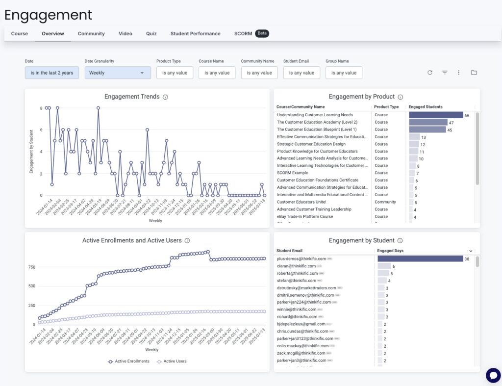
As you can see in the screenshot above, the chart in the top-left shows engagement trends over time. Below it, active enrollments and active users are plotted as two separate lines, so you can easily tell how many enrolled learners aren’t actually taking a course.
On the right side, the dashboard breaks engagement down by product and by learner. You can see how well learners interact with each course (or community, since Thinkific includes a Communities feature). You also get each learner’s email alongside how many days they’ve been engaged, ranked from most to least.
Across the top, a set of filters lets you tailor the view. You can filter by date range (the last six months, the last two years), by date granularity (weekly, monthly, yearly), by product type (course, community), by course name, by learner email, or by group name.
So if you want to see how a cohort engaged with a single course over the past quarter, you can narrow the dashboard to exactly that.
- The course dashboard
The course dashboard drills deeper into how learners interact with your courses. This is the view that helps you make informed adjustments to your content, so you can adapt and optimize it for better engagement over time.
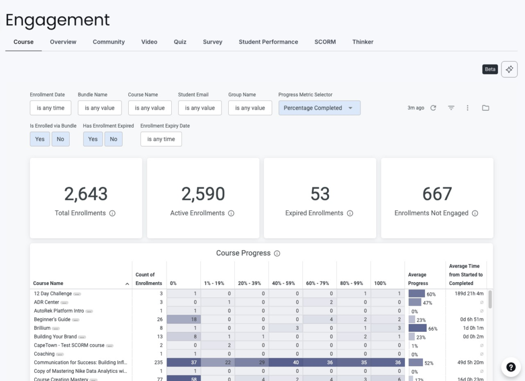
In the screenshot above, you get a quick rundown of total course enrollments, active enrollments, expired enrollments, and enrolled learners who aren’t engaged. Right away, that lets you work out how many people are enrolled in your academy but not in a given program, and how many are enrolled in a program but not interacting with it.
Below that, there’s a table showing progress across all your courses. For each one, you can see how many learners are enrolled, how far along they are by percentage, the average progress for the course, and the average time from start to completion.
If the average completion time runs longer than what you planned for, that’s worth looking into. And if learners keep getting stuck around the same percentage in a particular course, you can spot it here and go straight to that part of the course to find out what’s tripping them up.
- The video dashboard
The video dashboard shows you how learners interact with the videos in your courses, including which ones hold their attention and where people tend to click away.
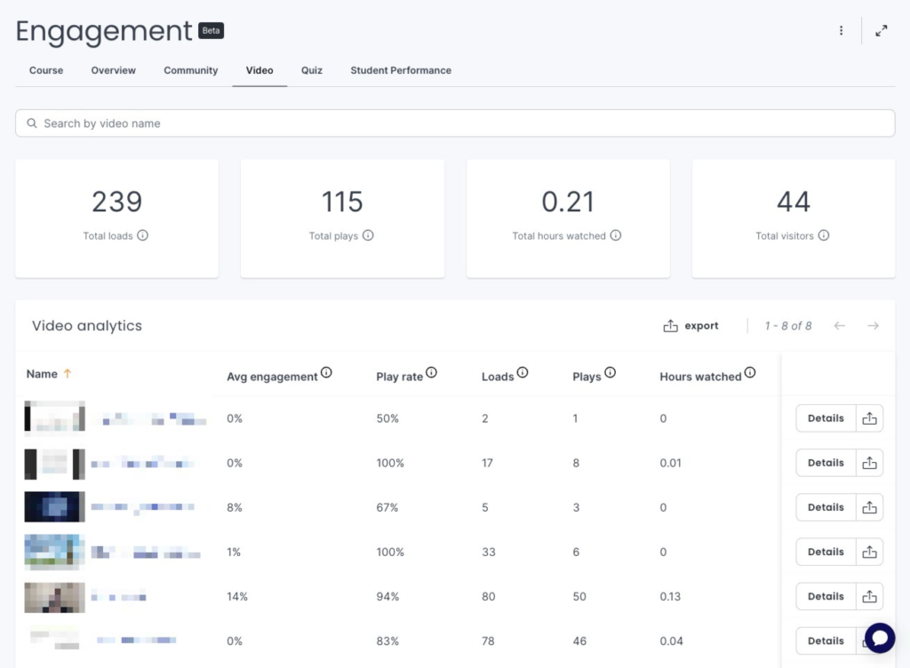
At the top, you get the headline numbers: total loads, total plays, total hours watched, and total visitors across your videos. Below that sits the detail, with per-video analytics covering average engagement, play rate, loads, plays, and hours watched for each one.
A low play rate tells you a video isn’t being watched, while a drop in average engagement tells you where people are tuning out. And since you know where each video sits in the course, you can match a video that’s performing poorly to a spot where learners tend to stall, then go back and re-record it or provide more context.
- The student performance dashboard
The student performance dashboard gives you visibility into each learner’s progress over time. It’s where you track a single person’s progress through your courses and identify the specific areas where they need extra support or resources.
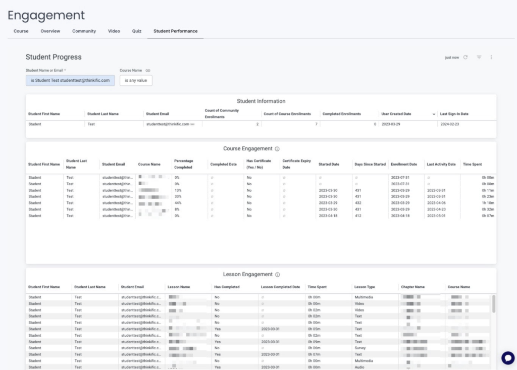
In this dashboard, you can enter a learner’s name or email to see exactly how many courses they’re enrolled in, which ones they’ve completed, the date they joined your academy, and the last time they signed in.
Below that, you get a full breakdown of how they’re doing in each course (or lesson) they’re enrolled in: the percentage they’ve completed, the completion date, whether they’ve earned a certificate and when that certificate expires, when they started, how many days it’s been since, their enrollment date, the date of their last activity, and the hours they’ve put into each course.
That’s a lot of detail on one screen, but each piece earns its place. For instance:
- If a learner hasn’t signed in for a while, you can catch it here and send an automated nudge reminding them to pick the course back up.
- If a learner has been enrolled for weeks but logged only a few hours in the course itself, the content may be boring or confusing, and that’s your cue to find out which it is and fix it.
- If a learner has finished a course and earned a certificate, you can see exactly when that certificate expires, so you can prompt them to renew before it lapses.
- If a learner is moving through one course quickly but has stalled in another, you can see the contrast at a glance and check whether the stalled course needs attention or they just need a push.
These four dashboards are available across Thinkific plans. For teams running larger programs, multiclient reporting, or customer education at scale, Thinkific Plus includes Advanced Analytics: build fully custom dashboards tailored to each stakeholder group, control access with role-based permissions so each team sees only what’s relevant to them, and schedule automated report delivery via email, webhook, S3, or SFTP so executives and clients stay updated without manual exports.
How organizations use Thinkific’s learner dashboards in practice
Virtual Fire Academy, led by Deputy Chief Peter Cutrer, runs accredited fire safety training for organizations including Disney, NASA, and Toyota through Thinkific.
With learners spread across multiple client organizations, Cutrer’s team uses Thinkific’s learner progress dashboards to see exactly where each learner stands in real time, catch anyone falling behind before a deadline passes, and track certification status without building manual reports. The same platform that delivers training also surfaces the data needed to manage it.
Track learner progress in real time with Thinkific
The dashboards outlined above give you a way to see learner progress in real time, rather than piecing it together after a deadline has passed. You can tell who’s on track, who’s drifting, and where your content is losing people, all from views that update as your learners work.
And if you want even more detail, there are a few dashboards we didn’t cover here:
- The quiz dashboard helps you understand how learners engage and perform on the quizzes in your program.
- The community dashboard lets you gauge engagement and identify your most active and top-contributing members, as well as the impact of their interactions. This one’s especially handy if you group learners from a course into a community so they can learn from and support one another.
- The survey dashboard lets you view and analyze full survey results, so you can better understand your learners’ experiences, motivations, and feedback.
A learner progress dashboard changes what decisions look like for training teams. Instead of discovering who fell behind after a deadline passes, you can see who’s drifting and step in before engagement breaks. Instead of building the same report by hand every week, you have a live view that updates as your learners work.
That’s the difference between a platform that stores learning data and one that helps you act on it.
Put real-time learner progress in front of the people who need it
Thinkific Analytics gives training teams a real-time view of learner progress across all courses and programs: completion rates, video engagement, per-learner performance, milestone tracking, and certificate status in one place. For organizations running larger programs or reporting to multiple stakeholder groups, Thinkific Plus adds Advanced Analytics: custom dashboards tailored to each audience, role-based access so each team sees what’s relevant to them, and automated report delivery so the right people stay informed without manual effort.
Start a free Thinkific trial to explore the learner progress dashboards firsthand, or book a demo with the Thinkific Plus team if you need advanced analytics and reporting for a larger training organization or customer education program.